Learn / Guides / UX design
The complete guide to UX
Introduction to UX design: key principles, best practices, and mistakes to avoid.
Every touchpoint users have with your brand and product contributes to the overall user experience (UX): the landing page that sells them on your product or service, the signup and onboarding flow, and every feature or element inside your product impacts UX and how users think about your brand.
The user experience often determines if users stick around, whether free users convert to paid, and whether they churn. UX is a concept that transcends every team and every role within an organization, and it’s an even more vital concept for product teams.
This guide covers everything you need to know about UX design. We start with introducing UX design, why it matters, and the key principles and best practices you should know about. In later chapters, we'll cover UX tools, surveys, metrics, how to conduct UX analysis, and key UX design trends (stay tuned!).
Hey product teams, customer delight is just one click away.
You already know it. It’s best for your users, it’s best for your business. But do you have the right information to...


What is UX design?
User experience (UX) design is the process of building products that are easy and enjoyable for people to use. By building products to be as effortless as possible for users, you can encourage adoption, retention, and loyalty.
UX is an iterative process of constant improvement: product teams and designers use data and usability testing to continuously refine the product experience so it becomes easier for users as the product develops.
The UX design process in 5 steps
There’s no universal workflow that every UX and product team follows—products, users, and internal processes vary. Some teams follow the Lean UX model, for example, which includes three broad phases:
THINK: teams draw on user feedback, product and usage data, competitive analysis, and other research to identify blockers and pain points, and brainstorm ways to improve the product to solve problems for their users.
MAKE: developers and designers build the change or new feature into the product.
CHECK: teams use surveys, A/B or multivariate (MVT) testing, and other tools and methods to check whether the change or new feature improves UX and solves the original problem for their users.
The basic UX design process we outline below is similar, but we break it down into five steps to illustrate the cyclical, iterative nature of UX design:
1. Research and understanding
User experience design begins with extensive UX research before any designs are mocked up.
User research: identify pain points, goals, blockers, and characteristics among users, and draw up detailed user personas that inform design decisions to keep the UX design process focused on users.
Market research: understand the market and similar products available, what those products share in terms of UX, and identify opportunities to differentiate your product based on UX.
Historical analysis: get a sense of the history of your product, and use previous iterations to inform future design decisions, ensure mistakes aren’t repeated, and continuously improve your product’s UX based on what you’ve learned.
2. Prototyping and wireframing
After the research stage, a designer creates a prototype and wireframe of your product, outlining how users will flow from one feature or element to the next, and how the product will look visually.
The prototype is your minimum viable product (MVP): a version of your product with enough features to allow your first users to test it and offer feedback. The prototype generally doesn’t look like a finished product, but it provides a sense of how the finished product will work.
Prototyping and wireframing—and then testing, which is the next step—lets you get valuable user feedback before you spend resources finalizing your product, potentially avoiding a lot of work and time spent developing the wrong features and UX for your users.
3. Testing
Next, your product team will conduct user tests—like A/B tests, MVT, and split tests—to identify existing or potential design issues that may cause friction for users. For example, your team may find:
The UX is confusing and prevents users from accomplishing their goals
Some features aren’t worth developing further because users aren’t interested in them
Certain user actions create friction in the product experience
Some user testing may include using product experience and behavior analytics tools like heatmaps and session recordings and collecting user feedback that can help identify blockers and pain points (more on this later).
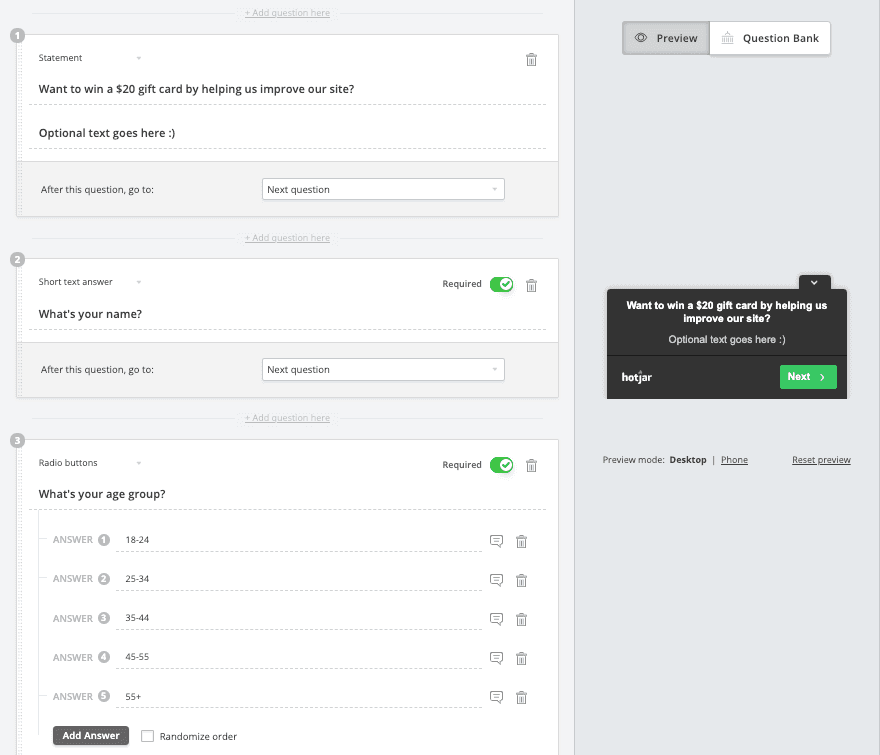
If you’re using Hotjar 🔥
Use on-site Surveys to recruit testers from users on your site. Just create a Survey from your dashboard, add a Statement to invite users to participate, then ask a few follow-up questions to better understand your testers.
Optional: offer incentive to testers to encourage participation!
4. Launch
Throughout the testing phase, you’ll refine your prototype based on results and user feedback, make changes, and add final touches before launch.
Once your product is ready, launch is often done in stages. For example, your UX team might release a beta version or ‘soft launch’, where a new design is launched to a small group of users first, to get additional user feedback and usage data before rolling it out to your whole user base.
5. Iteration
UX design is a constant, iterative process—you’re never done creating good UX—so more testing follows the product’s launch.
In the iteration stage, your team will continue to make updates and improvements as needed, and closely monitor how those changes impact the product experience.
A/B and multivariate testing are often part of this stage, so your team can see the impact of product changes and compare multiple versions of the design to see which creates the best user experience. Then the winning version is rolled out.
UX design in action
When the Product Design team at Razorpay wanted to launch an update to their user dashboard, they took the ‘soft launch’ approach we mentioned earlier, releasing the new design to 10% of their users and gathering feedback.
Using Hotjar Surveys, they asked users to rate their experience with the new dashboard:
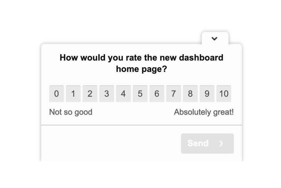
If a user gave the new design a low score, the team used Survey Logic to ask open-ended follow-up questions to understand why the user gave the dashboard a low rating.
The survey feedback helped the Razorpay team understand how their users felt about the new design and identify areas where they could improve UX before launching the new dashboard to the rest of their users.
The difference between UI and UX design
User interface (UI) design is a part of UX design that focuses on the visual look of a product. For example, a UI designer may focus on the layout of a website page or app screen, or the color used for CTA buttons.
UI and UX design are often confused or considered to be the same thing. That's understandable: the user interface is a part of the user experience, but UI design is more narrowly focused on the visuals and aesthetics of the interface users see, whereas UX is a broader process of identifying and solving user problems.
For example: typography, color scheme, branding, button design, animations, and imagery are all a part of UI; while user flow, product features, and accessibility are a part of UX.
Improve UX with product experience insights from Hotjar
Use Hotjar to understand how real users are experiencing your website or app—then improve it for them!
No credit card required

No credit card required

56,549 users signed up last month

GDPR- & CCPA-ready

Why is UX design important for product teams?
A poor user experience will cost you customers: if users aren’t satisfied with their experience in your product—if it’s difficult for them to navigate, if they encounter bugs or issues that cause friction—they might churn.
But improving UX can increase conversions: when you make UX design a key part of your product development process, and keep product experience top of mind, you can mitigate churn.
Investing in the user experience will help you create a valuable product that solves problems for your users and helps them reach their goals. Your product team, in particular, can draw on UX design to:
Convert more users
Drive adoption
Boost customer retention and loyalty
Banish churn
4 key principles of UX design
In many cases, 'good UX design' can be a little murky and hard to wrap your head around. After all, UX is all about the user and helping them reach their goals—and that varies from one product and one user base to another.
That said, good UX is really just a user experience that solves users' needs in the most frictionless and enjoyable way possible.
Here are four things good user experiences have in common:
1. The user comes first (always)
The number one principle of UX design is that the user comes first. It may sound obvious, but given the myriad internal priorities and pressures product teams face, it’s worth mentioning.
Good UX design centers the needs of users in every decision—the product helps users reach their goals or solve their problems in the fastest, easiest way possible. Every part of the design, every change, and every new feature flows from that.
And there’s a reason user-centered design is such a competitive advantage for companies that get it right: it isn’t always easy to put users first. Your business goals become secondary—of course you have goals, but they shouldn’t interfere with the users' needs and goals.
In fact, your business goals should be a reflection of your users' needs and should work to support them.
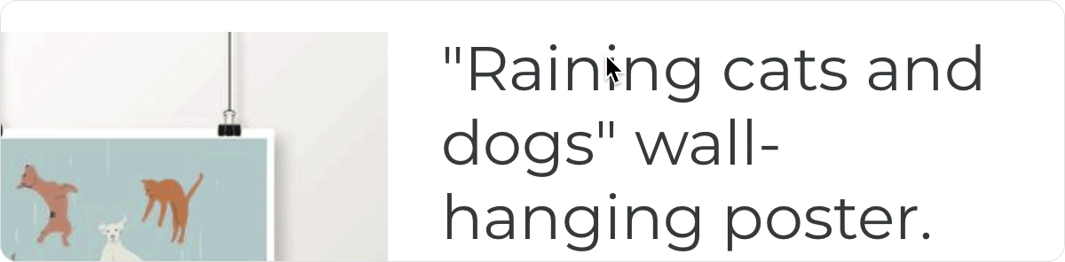
Recipe websites are a great example of this: lengthy written blog posts help their recipes rank in search engines, but they also get in the way and prevent users from getting to the content they want to see. (We just want to know how to make the food so we can eat the food, please!)
To improve the user experience, some sites add a ‘Jump to recipe’ button so people can get what they came for as quickly as possible.
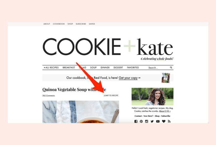
Some recipe websites put the user first with ‘Jump to recipe’ buttons
2. Simplicity, hierarchy, and consistency
(Okay, so maybe these are three principles in one, but they’re very closely related.)
Simple, hierarchical, and consistent UX design enables users to quickly and easily find what they’re looking for and do what they came to do. Whenever possible, your product should use the simplest design, the simplest copy, and the simplest actions to get users where they want to go.
That doesn’t mean you need to emphasize simplicity over function, of course (more on that in a second)—but you should simplify your UX design, eliminate visual clutter wherever possible, and cut any unnecessary elements or steps that complicate the user experience.
Then, organizing your design with a clear hierarchy ensures the product elements that remain are easy to understand and navigate. Users should be able to find exactly what they’re looking for without spending too much time in your product.
Finally, consistency: UX extends far beyond the experience users have inside your product. It also includes things like branding, marketing, and support. Creating a consistent style and ‘feel’ across all user touchpoints helps to unify the user experience.
Apple’s App Store is a good example of this: users can pick up any device—be it an Apple Watch, MacBook, iPad, or iPhone—and the product experience is consistent, with similar gestures, icons, hierarchy, and visual style.
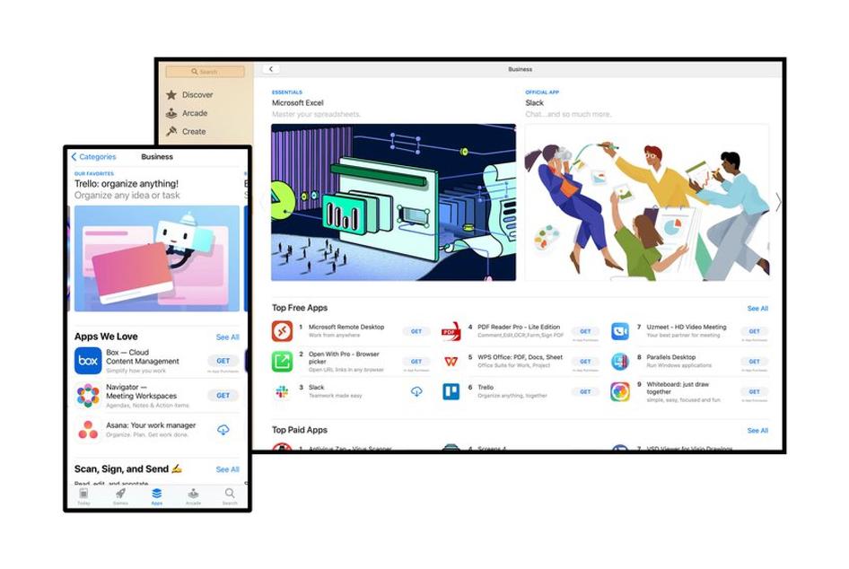
'Get' means the same thing across Apple devices
3. Functionality first, then design
Product function comes before product design, which is another one of the differences between UI and UX: while UI focuses on the look of your product, UX focuses on how your product functions.
Good UX means making it as effortless as possible for users to do what they came to do on your site or app—that’s the ultimate goal. That means clarity and function always come first. The design itself should never make the users' life harder or slower.
Moleskine’s iOS calendar app, Timepage, is a counter-example: the app lets users choose the color theme, but while the UI looks cool, it makes it harder for users to view their options and tap the color they want.

4. Draw on the familiar
Great UX leans into design frameworks and interactions that make sense for users, giving users what they expect.
Designing interactions that aren’t familiar to users may add barriers and make it harder for users to accomplish their goals, because it creates a learning curve when users adopt your product.
Drawing on elements and interactions users are familiar with often makes for better UX.
Some mobile apps are a great example of this: iPhone users are used to swiping right and left, so the UX of every iPhone app can benefit from drawing on that familiar interaction. It’s what users expect, and building that into your design ensures users have an easier time using your product. That’s why Tinder does it!

UX design best practices for refining products
The four principles above are a great place to start and can help you get a better sense of what makes a good user experience. Now, let’s get into how you can create that kind of experience.
Start with a deep understanding of users and their intent
The first step in the UX design process above is 'research and understanding'. Whether you’re building a new product from scratch or iterating on an existing one, you still need to start with a deep understanding of your users and their intent.
There are a lot of ways to develop that understanding—like using behavior analytics and product experience insight tools, listening to sales and support calls, and analyzing product usage data.
But there’s no substitute for actually talking to your users. Often, that looks like either an online survey or a one-on-one interview. Both can help you better understand customers, empathize with their needs and challenges, and build valuable user personas to refer to throughout the UX design process.
Note: visit the UX surveys page of this guide for some examples of UX-specific questions to ask your users to get the feedback and UX metrics you need to create the best user experience.
Develop a plan for how users should experience your product
UX and product experience tools—like heatmaps and session recordings—can help you visualize how users move through your product, but that information is even more helpful when you have something to compare it to: your ideal user flow.
Based on what you know about why people use your product, you should be able to map out an ideal user flow with the steps users need to take in your product to accomplish their goals. (This is much like a customer journey map.) For example:
To send money to a friend using Venmo, a new user needs to: download the app > sign up for a new account > connect and verify their bank account > search for their friend > enter the dollar amount > and send the money
For an ecommerce store, the user flow might look like this: click on Instagram ad > browse products > view product page > add product to cart > start checkout and create an account > and complete checkout
That ideal flow drives everything inside your product, from design and interactions to content architecture and element hierarchy.
Monitor user behavior for signs of friction, and eliminate blockers
Your ideal user flow helps inform initial product design and serves as a baseline for continuously improving UX. When you see users deviate from your ideal flow—when they encounter blockers or friction in your design that veers them off course—tools like heatmaps and recordings can help you quickly identify user pain points, so you can remove them.
For example, if you see users dropping off before reaching their goal, analyzing session recordings can help you identify possible explanations. Then, you can ask for more feedback to help you understand why the drop-off is happening. Maybe an element distracts users from taking the next step, for example, or a dialogue box blocks the next step on mobile.
🔥 If you're using Hotjar
Use rage clicks as a filter in Session Recordings to pinpoint the moments when a user repeatedly clicks on an element or area of your site, which can help you identify blockers or friction points in the user experience. Use what you learn to prioritize changes to optimize UX and improve the customer experience.
Bonus reading: learn how to analyze rage clicks to understand customer behavior and improve the user experience.
Consider the multi-platform experience
Users should enjoy the same easy, frictionless experience no matter how they access your product. If your product allows for mobile, tablet, and smartphone usage, the design should support that with good UX regardless of the device.
For example, a behavior analytics or product experience tool can help you get feedback on how mobile users behave in your product. Then, you can compare the mobile user experience to your web or desktop product experience and identify how the experiences differ across devices.
If there are any variations, you can dig deeper by combining tools like session recordings and feedback surveys to identify why users behave differently across platforms and how you can build a more consistent UX.
Ground users in the product
Good UX design is proactive about giving users a sense of where they are, where they can go, and how to get back to where they started. Clear and explicit navigation is key—without it, it’s easy for users to get lost in your product. When that happens, it slows users down, they can't do what they came to do, and they have a bad experience.
For example, think about a web app you might file your taxes with:
There are modules for personal details, income, and deductions and credits. Let’s say you wrap up the income section and move on to deductions, but then you find a rogue income form hidden under one of your stacks of paperwork. You need to go back to the income section to add it, but how?
There’s no obvious navigation to take you back to the income section. Will the ‘back’ button take you there? Can you go to the ‘home’ screen and find it that way? Will you lose the information you’ve entered if you do?
Oh, the suspense.
Good UX design recognizes that some users take a nonlinear route through a product. To accommodate the nonlinear journey, use clear markers and explicit navigation cues to help users move within your product.
5 common mistakes product teams make with UX design (and how to avoid them)
When you’re building a product and trying to balance user needs with internal requirements, it’s easy to make mistakes. Here are five common mistakes product teams make when designing for UX and how to avoid them:
1. Failing to make user-driven product decisions
The mistake: one of the most common mistakes product teams make with UX design is failing to put the user first. Especially as you gain experience in your role and within your product, it’s easy to fall into the trap of believing you know what users want or need—but the reality is you are not your user.
How to avoid it: proactively gather user feedback and let that feedback drive changes to the product. Use feedback to validate whether users need (or even want) the features and updates on your product roadmap.
2. Aimless redesigning
The mistake: UX design is a constant, iterative process—but that doesn’t mean you need to constantly and completely redesign your product. Users often don’t like change, even if it ultimately benefits them, so there’s no use in aimlessly designing and redesigning your UX.
How to avoid it: if you don’t have a compelling reason to change things—if you don’t have a clear goal and business case for the redesign—don’t do it. When you do need to make changes, avoid shocking users by keeping changes small and iterative, gathering feedback via A/B or multivariate testing as you go.
3. Not testing before iterating on product design
The mistake: this one goes hand-in-hand with Mistakes 1 and 2—if you think you know what users need, you aren’t likely to spend time testing, gathering feedback, and iterating.
How to avoid it: testing and iterating is important at every stage of UX design, but it’s particularly important for prototyping. Testing pre-launch iterations is key to ensuring you’re heading in the right direction before going through the launch process.
4. Giving users too much
The mistake: too much information, too many options, too many features… giving users too much of anything can spell problems for the user experience. This goes back to the 'simplicity' principle we talked about before.
How to avoid it: if a graphic, button, or feature isn’t 100% necessary, cut it. Otherwise, you risk confusing and overwhelming users.
5. Siloing UX decisions within the product team
The mistake: if you silo UX decisions within the product team, you can’t create a consistent experience for users. UX design is a cross-team effort—creating consistency across the whole user experience requires a coordinated effort from teams across your whole company.
How to avoid it: product teams should work together with marketing, support, design, and other teams. Share user data and feedback across teams, collaborate on any big UX design changes, and keep other teams in the loop.
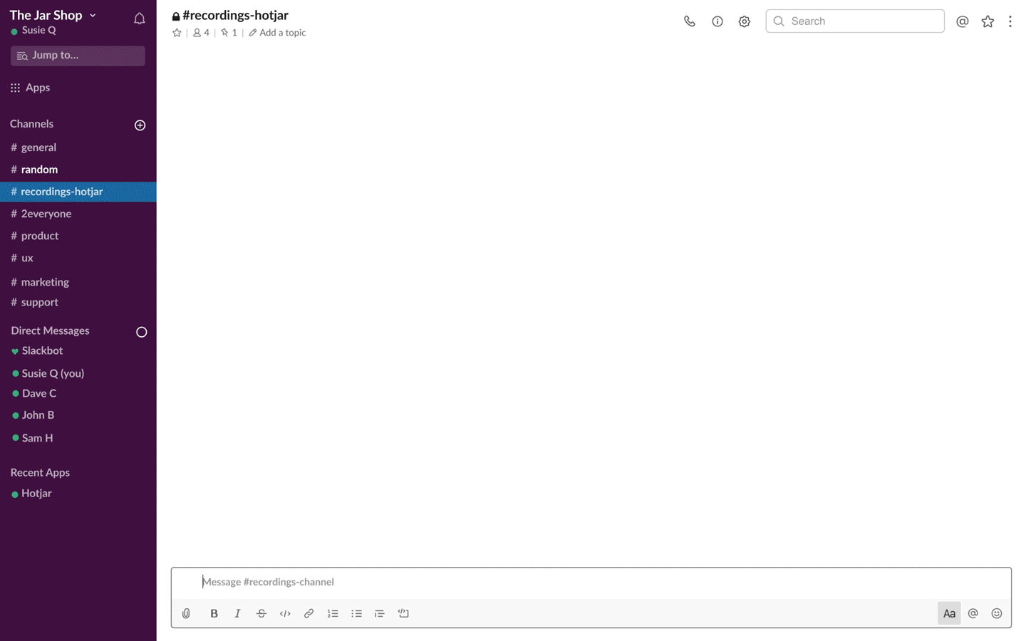
If you're using Hotjar 🔥
Whether your team has new targets, you’re going through a redesign, or you’re prioritizing product optimizations, back up your plans for your next moves with experience insights from real users in Hotjar and get the conversation flowing in Slack.
It's easy:
Improve UX with product experience insights from Hotjar
Use Hotjar to understand how real users are experiencing your website or app—then improve it for them!